Lyrois
Behind the Scenes


Let me suggest you tweet this:
The problem with repetitive patterns is that you get lost. I want enlightenment, or at least temporarily illuminating the dark side of intricate, entangled, lines and shapes.
We're talking about patterns here, patterns that are great to look stare at but hard to make. Well, not that hard, actually.
Starting at the end, here is the result, this is what we want, everyone --

And this is what it's made of, where pattern recognition comes into play -- the smallest atomic piece that, once repeated, makes up a whole tiled wall or wallpaper --

Now, let's deconstruct this pattern and analyze it --

The small shapes correspond to #1 while the larger figures are represented as #2.
Elements are turned upside down, rotated, mirrored, morphing into on another and through the boundaries of the boxes.
There is just one rule: The top has to fit seemlessly to the bottom and the left must fit the right -- without mirroring; any mirror effect has to take place within the tile, which doesn't have to be square, obviously.
See what happens in these inaccurately drawn, schematic tiles --

The hard part, and the art part, is to work as accurately as possible. This is important because the desired rapport is a seemless pattern.
Bonus points are awarded for avoiding the swastika pattern, which is way too easily created by rotating elements in an attempt to create visual "harmony." (Lyrois Pattern Law #1: When you think you're done, look for, and remove the swastikas.)
I'll leave you with some ready-made tiles that you can use as your Twitter background image, just right-click, save-as, and you're done --


As for the second tile, who can tell me something about this one, concerning normalization and pattern recognition?
See also --
Labels: 2010, art, interior+design, lyrois, making+of, monogram, murals, patterns, print, store+furniture, twitter, wallpaper
Let me suggest you tweet this:
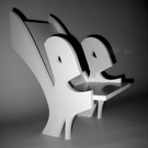
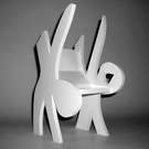
The eighth, and for now, final Lyrois chair, #18, for Patio & Lounge --

Chair #18 is based on the original Lyrois shape #18, a somewhat lost (but beloved) child from the family, it appeared never before.
Models are made in hard wood and a very limited collector's edition will be made from translucent and colored acrylic glass.
Please inquire about prices, colors, and availability via lyrois [at] googlemail.com.
You might want to read the backstory and see a list of models.
Labels: 2010, architecture, art, chairs, commissions, furniture, interior+design, lyrois, store+furniture
Let me suggest you tweet this:
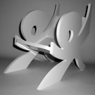
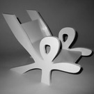
The seventh Lyrois chair, for Showroom & Stage, #13 --

Chair #13 is based on the original Lyrois shape #13, featuring fluid lines for soft curves.
Models are made in hard wood and a very limited collector's edition will be made from translucent and colored acrylic glass.
Please inquire about prices, colors, and availability via lyrois [at] googlemail.com.
You might want to read the backstory and see a list of models.
Labels: 2010, architecture, art, chairs, commissions, furniture, interior+design, lyrois, store+furniture
Let me suggest you tweet this:
... or how to make gradients with only fill and stroke -- in fact, stroke will be perfectly sufficient.
It was going to be called "meaningless graphics #1 through #6."
As always, I could invent some crazy-ass legend and try to convince someone, somewhere, that in reality, I had such and such idea, and was looking for the right way and time to eventually express it. Really.
Except, I didn't. Didn't intend to, at least. Make a series of 6 graphics, have the minimalistic approach grow into something kinda elaborate, and wait for the questions. The inevitable. Why 6? Why are they similar, different, purple, what are those lines? Inevitable.
Of course, reflecting upon the dreaded questions lead to answers, and, you guessed it, some crazy-ass legend. Talk about going full circle, a dialogue evolved out of and into never meaningless graphics.
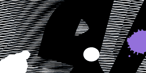
A short story in six parts --
Veiled struggle behind darkness, emerging into the light only to be sucked back into the dark, emerging again, you can't do it on your own, join forces already!
Obviously, the darkness leaves its traces, impossible to tell who is who, also, struggle changes, together, united, you make it. What's left of you? Are you still the same? Did any part of you remain untouched? Don't think so. Never did.
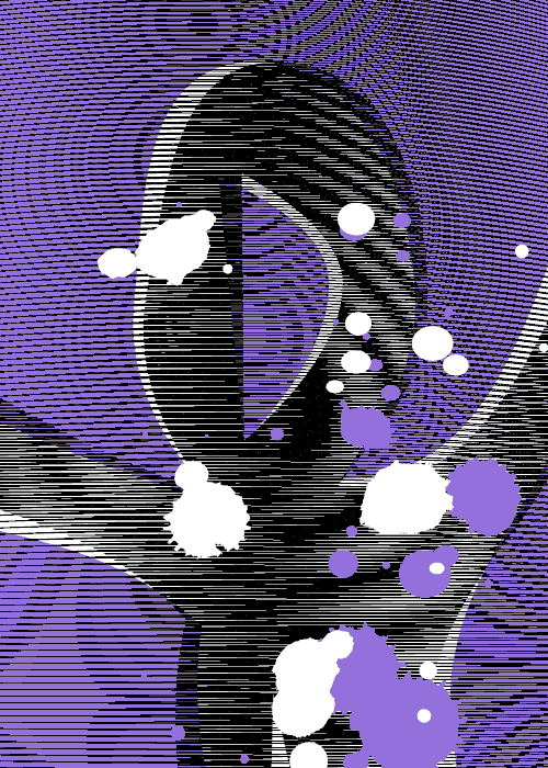 Here I am, drowning, being sucked in.
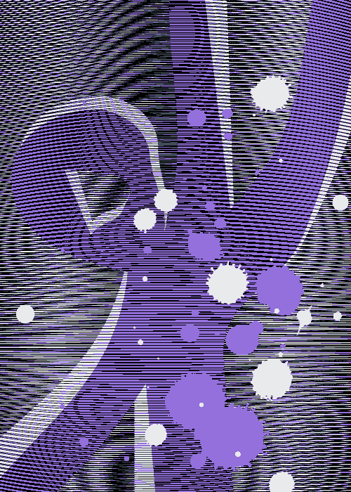 Hey, it's me. You ain't drowning.
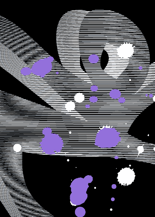 Now, that's better. Can you feel the air?
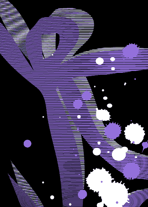 Trying to show you the light.
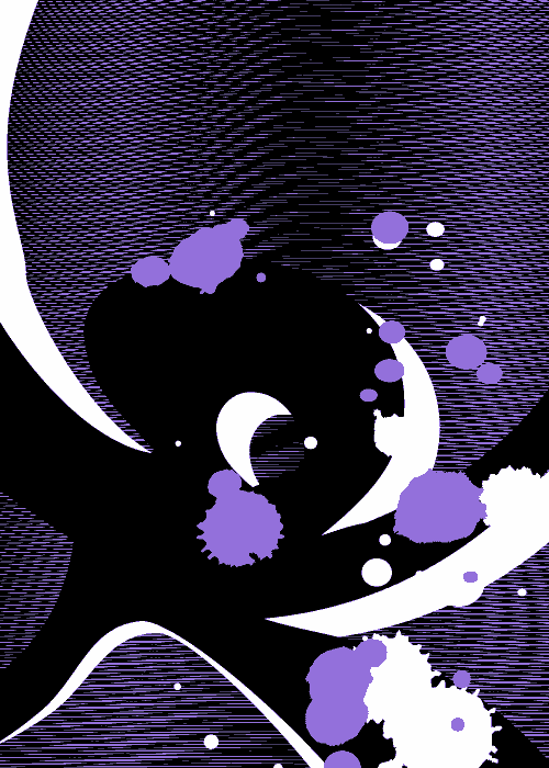 You're losing me.
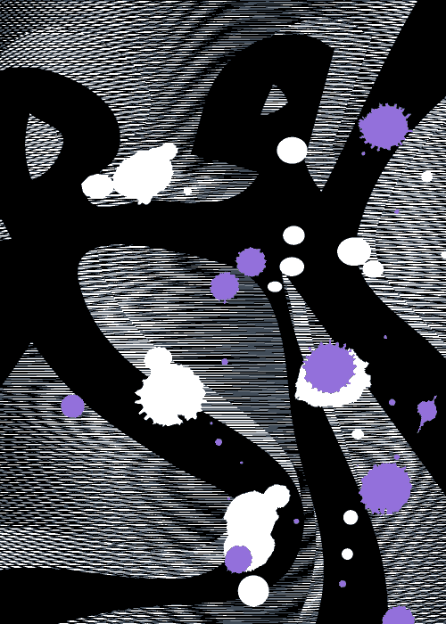 No! Reach out -- See how we changed?
What? Make of it what you want.
Note: You should will see the print version of this series. Where the moirés are static and pixelated on the screen, they visually live and move in high-res printing.
Let me suggest you tweet this:
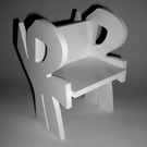
The sixth Lyrois chair, is a reunion of twins, for Garden & Patio, #16 --

Chair #16 is based on the original Lyrois shape #16, a very special garden & patio chair, it's a metamorphosis of two models, each one of them made from the same shape, one side being upright and the opposing side being upside-down.

Models are made in hard wood and a very limited collector's edition will be made from translucent and colored acrylic glass.
Please inquire about prices, colors, and availability via lyrois [at] googlemail.com.
You might want to read the backstory and see a list of models.
Labels: 2010, architecture, art, chairs, commissions, furniture, interior+design, lyrois, store+furniture
Let me suggest you tweet this:
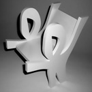
The fifth Lyrois chair, #12 --

Chair #12 is based on the original Lyrois shape #12, a simple, inviting audience chair.
Models are made in hard wood and a very limited collector's edition will be made from translucent and colored acrylic glass.
Please inquire about prices, colors, and availability via lyrois [at] googlemail.com.
You might want to read the backstory and see a list of models.
Labels: 2010, architecture, art, chairs, commissions, furniture, interior+design, lyrois, store+furniture
Let me suggest you tweet this:
The fourth Lyrois chair, in fact, a stool, #06b --

Chair #06b is based on the original Lyrois shape #06, a bar stool, the companion piece to the director's chair.
Models are made in hard wood and a very limited collector's edition will be made from translucent and colored acrylic glass.
Please inquire about prices, colors, and availability via lyrois [at] googlemail.com.
You might want to read the backstory and see a list of models.
Labels: 2010, architecture, art, chairs, commissions, furniture, interior+design, lyrois, store+furniture
Let me suggest you tweet this:
The third Lyrois chair and a bench variation, #06a --

Chair #06a is based on the original Lyrois shape #06, a director's chair and a variant as a bench.
Models are made in hard wood and a very limited collector's edition will be made from translucent and colored acrylic glass.
Please inquire about prices, colors, and availability via lyrois [at] googlemail.com.
You might want to read the backstory and see a list of models.
Labels: 2010, architecture, art, chairs, commissions, furniture, interior+design, lyrois, store+furniture
Let me suggest you tweet this:
Parts and pieces from a recent discussion on Twitter on a question by Clint Watson whether Seth Godin is demeaning or enhancing the word artist in his recent book Linchpin: Are You Indispensable?
Quotes from Seth Godin --
Acting like an artist. Being personal, making change, communicating a vision.
You do art when you make change that matters, and do it via a connection with an individual.
Artists take it farther than that, much farther. That's our assignment.
Other relevant quotes --
Art is a liaison between some sort of deranged mentality and others who are not going through it.--John Chamberlain
Being good in business is the most fascinating kind of art.--Andy Warhol
It's not so much where it's made than why it is made. Also, for whom something is made might be significant. Why, when, and for whom, are all relevant, as opposed to where.
On the "artist" label --
Once artists are or feel offended, they have some work to do. I'm with Seth that art is the expression of any kind of mastery. Many contemporary "artists" are kinda far away from classical fine art, yet they're "artists." Seems that Seth Godin targeted just the right word and people. Fighting for a label is fighting for some misunderstood ego.
I try to express my vision and that's about it. Could care less if I or the pizza guy is labeled artist or not. It's genius how Seth manages to divide artists, it's about time for some trouble. The irony being that those defending their "artist" label lose authenticity and thus face.
Replies from John T. Unger --
I've always tried to make my art be about ideas and meaning larger than myself, sort of channeling bigger voices if I can.
I'm not sure where I fall on the "art for art's sake" thing but I consider myself to be in service to the art, not vice versa...
The artist's job is communicating/convincing the world that "there is more."
John T. Unger on the artist's role --
No one is more responsible for the society's valuation of art than artists themselves. If art is not valued it's our fault.
I see a lot of things no one else sees. Some of them are even real!
On editing --
Lately, I'm finding myself editing not just for clarity but to polarize. It clarifies positions. I see editing as removing the unnecessary, with whatever technique. The distinction between editing and composing is often artificial anyway, I'm faster this way.
On exclusivity --
You don't you have to be an artist to value art. That's the worst outcome: Creating art exclusively for fellow artists. Artists are rare. It's HOW you do it that defines what it is. Why should the term "artist" be reserved only for people who think they are? What about creative, elegant, and graceful self-expression ...
When objection against using the term artist comes from artists trying to preserve exclusivity -- it's time to shake things up. Which brings "therapy" into play. What about artists for whom art is therapy?
You're an artist through expression of some sort, combined with excellence in something. Or so. Where to draw the line, if any?
A great metaphor for art itself --
I don't paint things. I only paint the difference between things.--Henri Matisse
P.S.: I didn't receive the book yet, and I think the artist discussion is only marginal to the book itself. Fron the many reviews, the "emotional labor" part seems to be a more important part of the changing landscape.
P.P.S.: Following and especially threading a Twitter-discussion depends on the angle of perspective. Mine in this case. Whoever read or participated and contributed might have a different view and perception of the exchanged ideas.
Here is the backstory --
Labels: 2010, art, discussion, lyrois
Let me suggest you tweet this:
The second Lyrois chair, #02 --

Chair #02 is based on the original Lyrois shape #02, a lounge chair, companion piece to chair #10.
Models are made in hard wood and a very limited collector's edition will be made from translucent and colored acrylic glass.
Please inquire about prices, colors, and availability via lyrois [at] googlemail.com.
You might want to read the backstory and see a list of models.
Labels: 2010, architecture, art, chairs, commissions, furniture, interior+design, lyrois, store+furniture
Let me suggest you tweet this:
Taking pics of shadows. Again. And again. With the eyes of a child.

Cut from paper and suspended on nylon lines. (Based on the original Lyrois shape #11.)
The focus on EITHER shadow OR object is Heisenberg's uncertainty principle at work.
The more the object is out of perspective, the better perspective the shadow is in.
Or: The more distorted the object, the less distorted the shadow. And vice versa.
At some point, I may rewrite the Lyrois story since basically it is a form of puppetry, the shapes are puppets, I'm a puppeteer. Again, it's a matter of perspective.
Labels: 2010, art, lyrois, paper+cutting, purple, silhouette
Let me suggest you tweet this:
The first one from a line of exquisite furniture items, chair #10 is finally ready to be shown --

Chair #10 is based on the original Lyrois shape #10, a coffeehouse and lounge design piece.
Models are made in hard wood and a very limited collector's edition will be made from translucent and colored acrylic glass.
Please inquire about prices, colors, and availability via lyrois [at] googlemail.com.
You might want to read the backstory and see a list of models.
Labels: 2010, architecture, art, chairs, commissions, furniture, interior+design, lyrois, store+furniture
Let me suggest you tweet this:
Something new for 2010: A micro-manufacturing project featuring a line of chairs: A couple of lounge chairs, a director's chair, a bench, and a bar stool, ... all built around, of course, the LYROIS shapes.
Loud coffeehouses and calm lounges, as well as the big stage, or that stylish office -- a Lyrois chair might add the final touch in your quest towards extraordinary --

The prototype production is in progress, there will be high quality chairs in heavy wood and a line of collector's chairs in translucent and colored acrylic glass. Watch this space for updates and the different models dropping in.
As always, I am making these on a custom basis and am able to make the chairs according to your input; size, and color, and material-wise. The shapes can't be altered though, it wouldn't be an original Lyrois anymore...
You may contact me for options and prices via lyrois [at] googlemail.com.
Labels: 2010, acrylic, architecture, art, black, chairs, commissions, interior+design, lyrois, preview, store+furniture, vinyl, wood
Let me suggest you tweet this:
I don't play cards because it violates rule #7. Other than that, when I play -- if I play -- I play by my own rules with cards from my own deck.
Here is my hand, drawn randomly from the deck of 52 aces of spades --

Thorough preparation makes its own luck.--Joe Poyer

Obvious or not, there is more to it and in it, but it's a good starting point.
Labels: 2010, ace+of+spades, art, black, lyrois, miniatures, monogram
Let me suggest you tweet this:
Pantone unveils color of the year for 2010: PANTONE 15-5519 Turquoise --
Turquoise transports us to an exciting, tropical paradise while offering a sense of protection and healing in stressful times.
Enter LYROIS PURPLE --
The Lyrois color of the year stays Purple -- I just can't see it pairing nicely with any other color in the spectrum,
particularly not with Turquoise...
Here is why --
It looks like ice-cream.
And while I love ice-cream, it kinda takes the royalty from Purple.
Also, it hurts in the eye.
Don't you think?
Besides, explaining over and over that it's neither green, nor blue would be quite a waste of time, and guess what: Lyrois Purple is neither green, nor blue, without explaining.
In my eyes, it is Purple, which transports us to an exciting, tropical paradise while offering a sense of protection and healing in stressful times.
See?
The task will be to avoid Purple overload, in writing and in design.
 Subscribe to Lyrois: Behind the Scenes to get the latest updates. What about having the latest and the greatest delivered via e-mail? Subscribe here.